
Skosay is a shopper promotions company, focused on direct-to-consumer sampling for major CPG brands. In order to better communicate with CPG clients and their consumers, I worked with Skosay to rebrand, redesign the consumer-facing site and build a better client dashboard experience.
- Rebrand
- Website Design
- Dashboard UI Design
- Email branding
- Custom Box Design
- Nathan Hart Allen
Total Rebrand
I delivered a rebrand for Skosay including a new logo, a new color set, and a new marketing website. With a full suite of promotional tools for CPG brands, Skosay.com needed to promote every benefit of using the platform and make it appealing to brands whose visual language was loud and fun.


Desktop Client-Facing Site

Custom Script Type

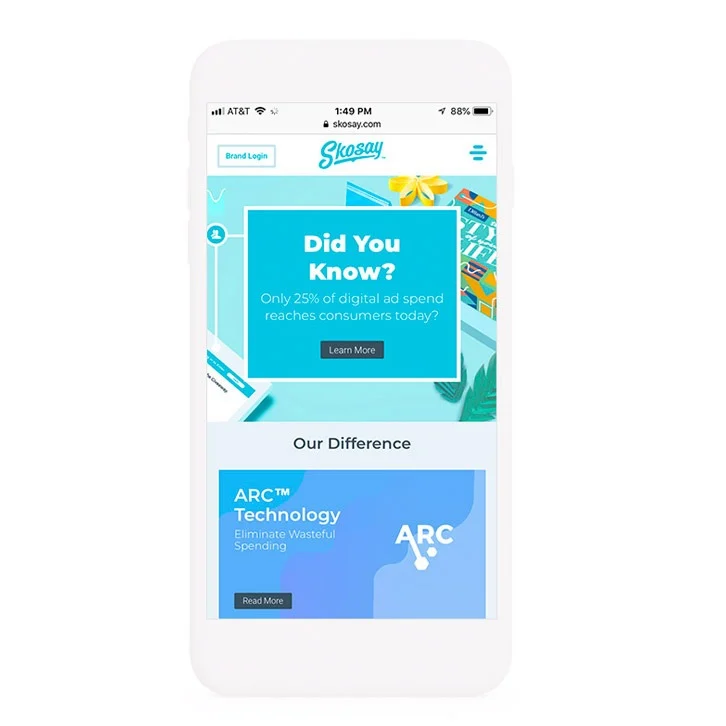
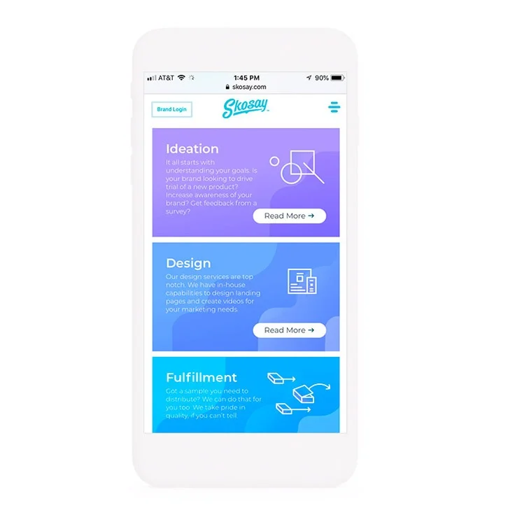
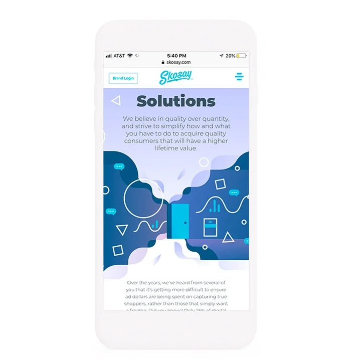
Mobile First Design
It’s now commonly accepted that 90% of traffic will be mobile. For that reason, Skosay.com and most of my web projects are designed for the mobile user, first, and the desktop user, second. Custom touches included a mobile menu with an animated screen that wipes to blue.
Client Dashboard UX/UI
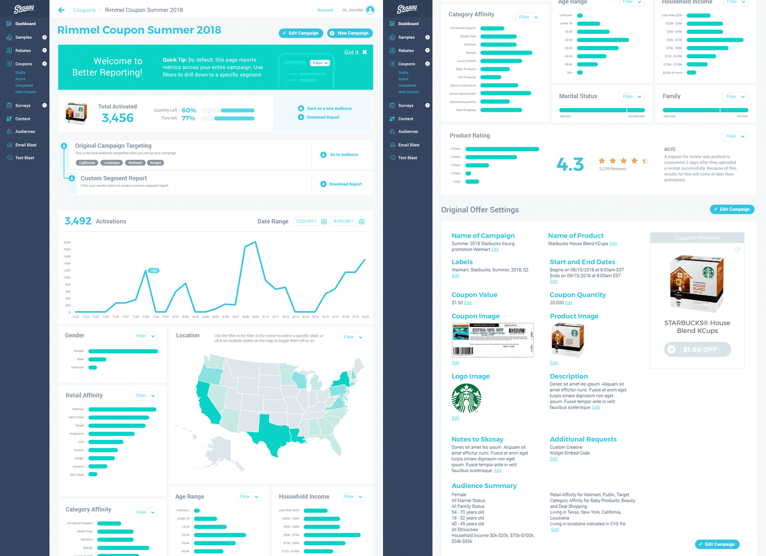
Skosay’s self-serve dashboard for spinning up new D2C campaigns was comprehensive to save the least. The ability to collect opt-ins on a custom landing page, fulfill the order for that campaign, and then measure the lift at the retailer was unheard of at the time.
Skosay Sample Box Design
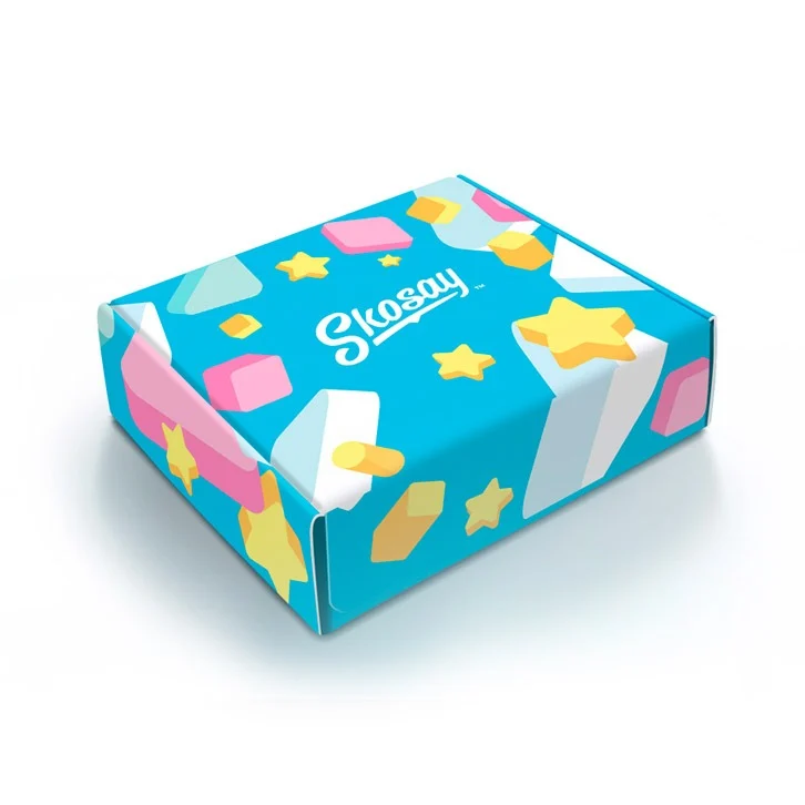
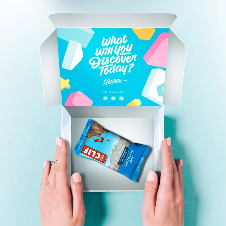
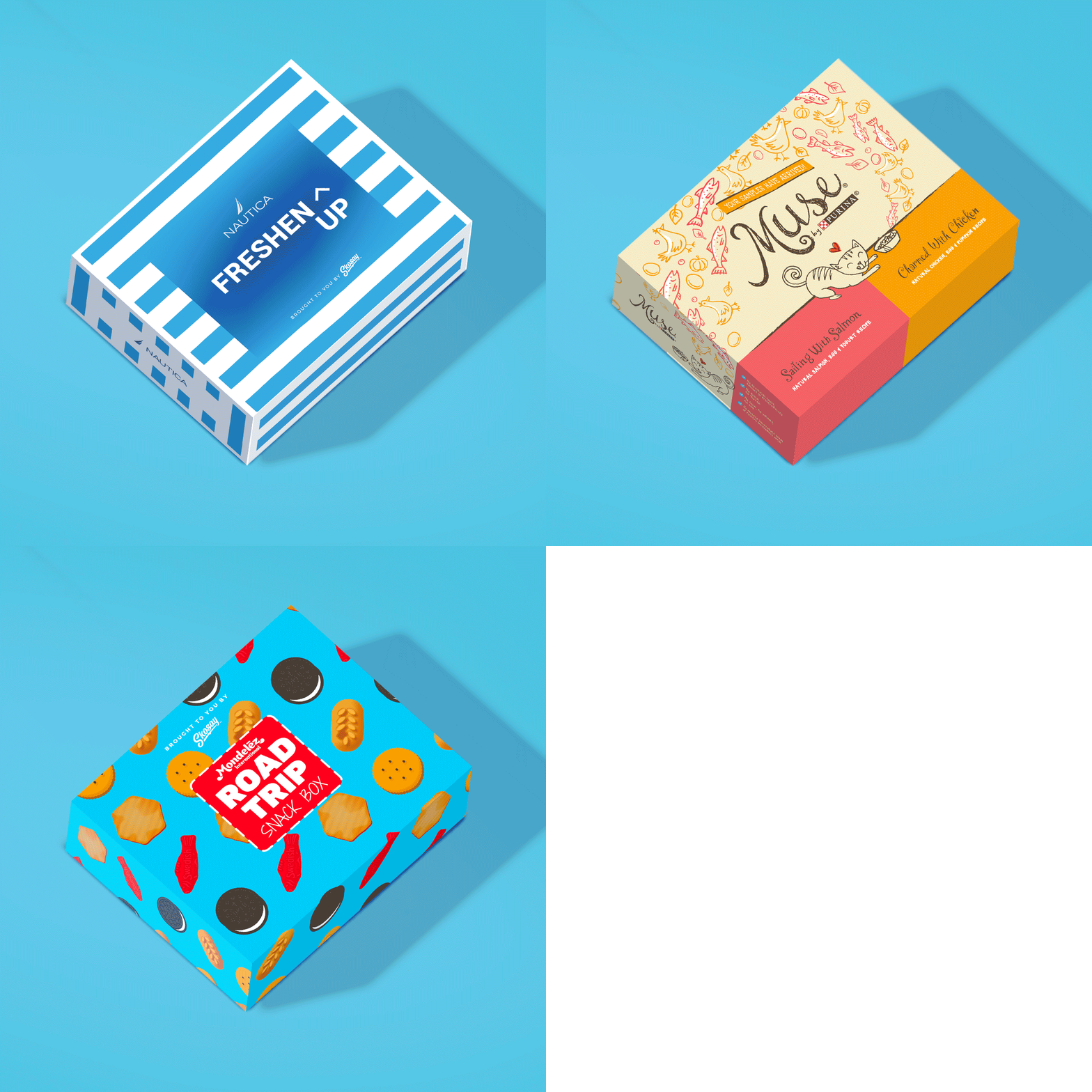
In Skosay’s process, once a consumer has opted into a sample campaign, they receive a box only two weeks later, filled with a particular product or group of products to try. Many times, the box is a custom design, fitting the brand, but many times there is no budget for design. Other campaigns are run by Skosay itself. For these no-brand situations, Skosay needed a box design that could fill the gap with memorable branding for the service itself.
Skosay Explainer Video
Because not every potential investor or CPG brand understood the vast potential of the product when they first saw it, I developed a script for an explainer video and animated the concept in a branded format.
10 Icon Set
For presentation, and for the website, a set of custom icons representing various aspects of the business and services/software provided was developed in a flat color palette.

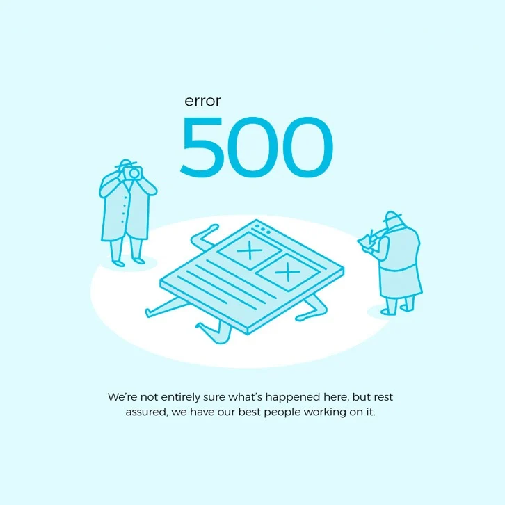
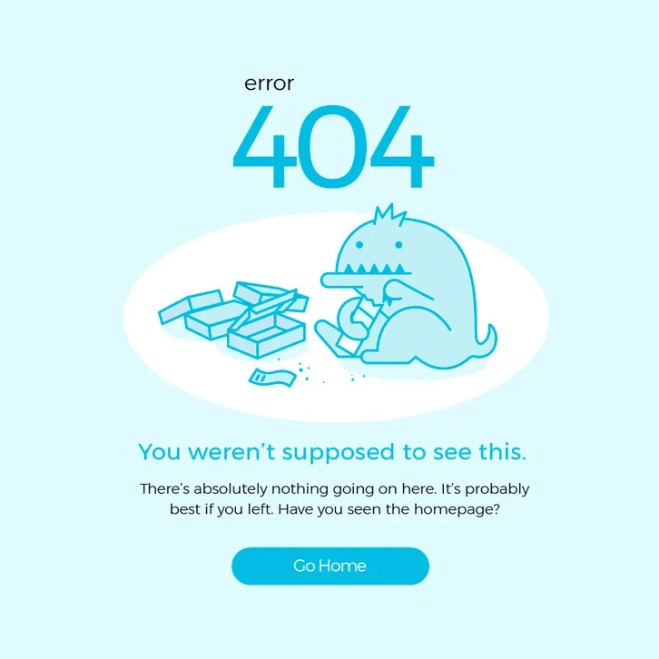
What is an experience without great error pages?
It’s never a vital part of the user experience, but I really love custom error pages. It’s a great opportunity to try to lighten the mood, when consumers may feel upset about technical problems. In the long run, if you can make the laugh just a little, your tech support is less strained.
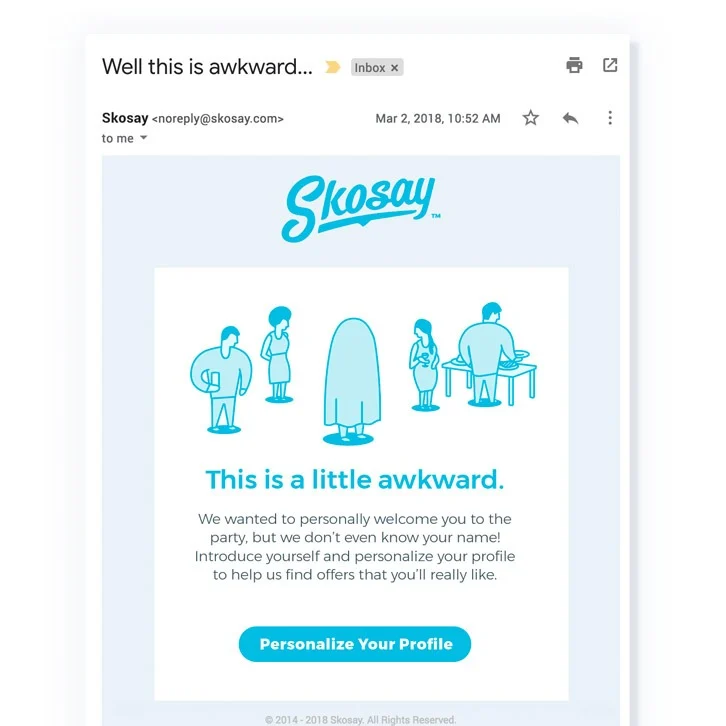
Email Experiences
Some of the most effective data gathering at Skosay happened through carefully measured, and timed emails. In design, I wanted to make sure the Skosay brand was very tongue-in-cheek and always looked at the fun side of things, even for forgotten passwords or mundane processes.